A Prager Redesign, Part 1: The Design
Published December 5, 2012
Our Prager redesign was started almost a year ago and there were several reasons why we decided to go forward with it: Most importantly, our old site was very dated. What was once a good design concept was now bloated and old-fashioned. Plus, it was no longer cohesive or innovative and there were many things lacking on the site that we needed to address. It did not display our vast body of work very well and it no longer represented who our Internet marketing agency was and of what we were capable of.
Here is our home page, before and after our redesign:

Our Goals
After many meetings, discussions, sketches, and spaghetti thrown on walls (not really, but it’s a great analogy), we agreed on the following goals:
- The site needs to reflect who we are and who we want to be as a company.
- It needs to be easier to use and more visually interesting. (Many of the sites we used as inspiration had big eye-catching graphics and bold colors.)
- We need to show potential clients that we can do anything for them and be able to back up our claims. (It’s one thing to say you can do anything and another to be able to prove it.)
- Since responsive design (sites that are mobile-friendly) is something we are now offering to all our clients, our site needs to reflect it.
With all that in mind, we began to do a lot of research. We looked at our digital marketing agency’s competitor sites, competitor sites from around the country, and many other design studios and discovered what we like and what we didn’t. Two designers, six months, copious amounts of coffee, and eight rounds of revisions later, we had a brand new Prager site.
If you saw our old Internet marketing agency site, it looked very different from what we have now. The site has undergone a huge restructuring. We wanted to create more effective layouts and content to better the user experience and as a whole, make the pages more readable and interesting.
Changes We Made
- Several new graphics were added to give users a better way to connect visually with our messaging.
- The global navigation was reworked so that it was more succinct.
- We condensed our original 43 links (7 parent links and drop-down menus containing an additional 36 links) to 5 links and eliminated drop-downs.
- To keep with the theme of making the site more visually interesting, we added a series of icons to represent our various services (branding each one with a friendly, easily recognizable graphical representation.)
- Our services were put into a 3×3 grid with short introductions. (We feel that this, coupled with the icons, makes the content more easily digestible and more intriguing.)
Creating New Sliders
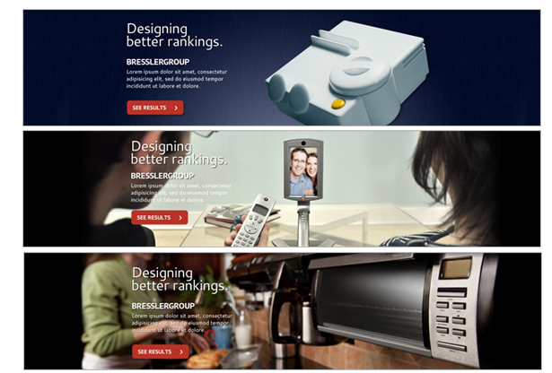
One of the largest new additions to our new Prager site is the slideshow on our homepage. We created three large, visually appealing slides to highlight our new client case-studies, quickly show visitors what we are all about, and entice them to read more.
The sliders went through their own round of revisions. We knew that we wanted something bold and dynamic, but there was a lot of back-and-forth about what kind of images we would use, which clients and services we should highlight, and what our overall messaging would be.
Our sliders, round 1:
Our sliders, round 2:

We also wanted to draw more focus to our site slogan (perhaps a mantra?) that summed up who we were in one sentence. We do so much more than just design websites and give clients a presence on social media. These days, a company’s website is their online (or in some cases, their only) store front. So not only does a website have to say where a business is located, but it is now the online receptionist (or Walmart greeter) for your business. It says “Oh hello potential customer, here is what I do and why I do it better than everyone else. I have proof! Call me to learn more!” That is what our slogan represents, we don’t just build websites. We build businesses on the web.
All in all, we’re extremely happy with how the redesign went. While there is always room for improvement, we all feel that we have a site of which we can be proud.
Next week: “A Prager Redesign Part 2: The Build”